


Standout colour and design
★★★★★
"Fits perfectly and the design is so fun!"

Style-forward leggings designed for modern outfits
15% off everything.
No code needed - the discount applies automatically at checkout.
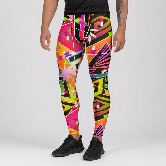
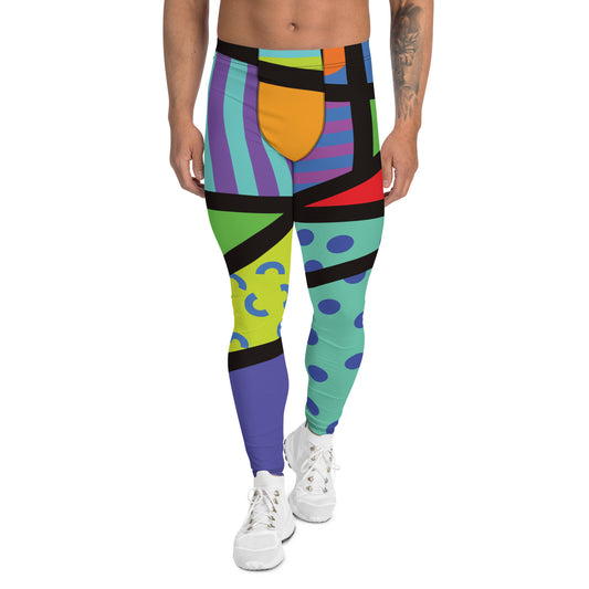
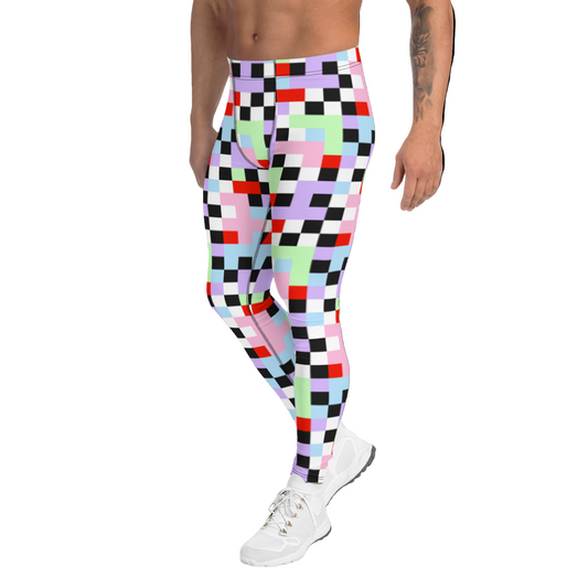
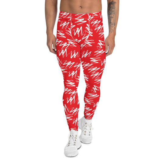
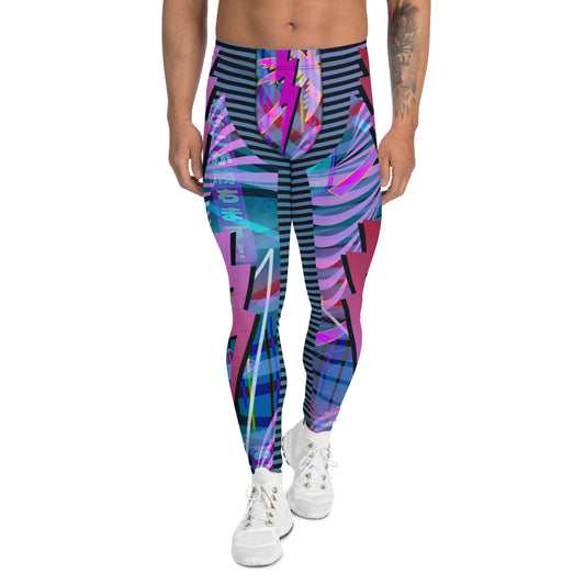
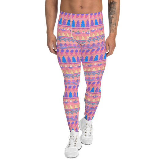
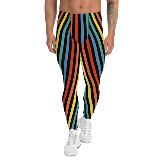
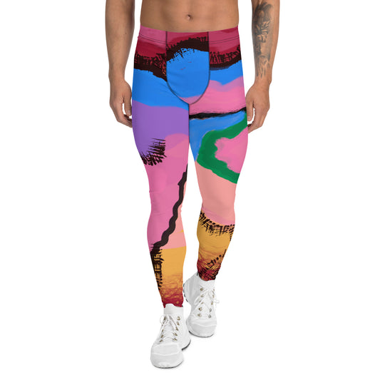
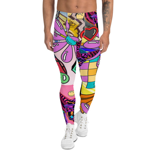
Men’s fashion meggings are designed for style-led outfits rather than training sessions. This collection focuses on graphic leggings built for streetwear silhouettes, layered looks, and confident statement dressing that treats leggings as a deliberate fashion choice rather than gym kit.
Bold geometric prints, retro colour blocking, cyberpunk panel layouts and Memphis-inspired pattern work give these pieces a visual identity that holds its own with oversized tees, hoodies, jackets and boots. They are built for everyday styling, nightlife environments and expressive modern menswear rather than performance training.
Some designs in this range also work naturally as rave and festival outfits. If you’re building a look specifically for events, explore the festival leggings collection.
Choose your ring style
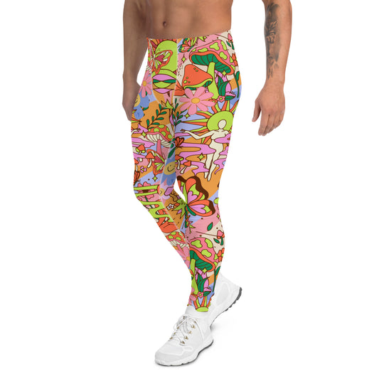
Many of the bold prints in this collection are popular for music festivals, rave events, and expressive streetwear outfits. If you're specifically looking for styles suited to festivals and creative events, explore our curated festival meggings collection.
These designs combine the comfort of men’s leggings with psychedelic prints, Memphis graphics, and vibrant colour palettes that stand out under stage lights and festival environments.
Many expressive leggings designs draw from retro-digital aesthetics and neon colour palettes.
Our guide to vaporwave fashion explains how this visual movement influences modern statement leggings and festival outfits.
Customer review
These reviews highlight the things that matter most in statement leggings - bold design, strong colour, soft comfort and a fit that feels good beyond costume or novelty wear.
"Fits perfectly and the design is so fun!"
"These are SO rad! My new favorite leggings. So many compliments on them. They're really unique and that's exactly what I was looking for. Yoga, casual wear, they can do it all!!"

Why Men Wear Leggings Men’s leggings - sometimes called meggings - are...

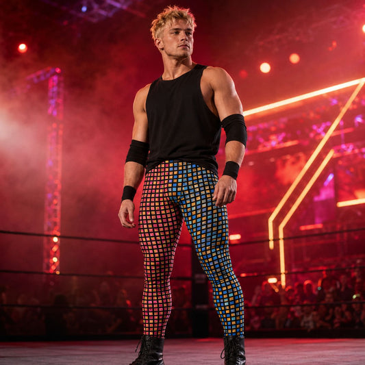
Men's Wrestling Pants and Tights - Ring-Inspired Performance Designs Men's wrestling tights...

Unlock your full potential in men’s gym leggings designed for movement, power...
Designed by Fans, Made for Movement
Each pair of BillingtonPix men’s leggings is hand-printed and sewn to order using durable, breathable spandex-polyester blends.
💎 Sweat-wicking
💪 Stretch tested
🎭 Exclusive designs you won’t find anywhere else
Why Men Wear Leggings Men’s leggings - sometimes called meggings - are...

Men's retro tank tops built for the gym, the festival stage, and...

Dominate the ring or the gym in joggers or built with the...

Bright colours, bold characters and full-tilt wrestling energy. Our Shirts & T-Shirts...
