

My bedroom wallpaper, when I was a teenager, was a series of squiggles in red, white and blue, flat pattern, no attempt at realism. It matched the duvet cover. I didn't know it had a name. I just knew it looked like nothing else in the house, and I liked that.
I was a teenager of the 1980s, which meant I absorbed Memphis design without ever being told what I was looking at. Whitney Houston's "I Wanna Dance with Somebody" video, with its graffiti sets and bold flat screens. The jaunty fonts on Top of the Pops. The neon and the day-glow on the street. Everything exaggerated - the hair, the shoulder pads, the money. For years I assumed that particular kind of bad taste belonged to the Seventies. It didn't. It belonged to us.
When I looked into it properly, the story got stranger. The people responsible for a huge amount of that visual language - the Memphis Group - were not a commercial success in their own lifetime. Not even close.
Where Memphis actually came from
The Memphis Group formed in Milan in 1981, brought together by Ettore Sottsass, who wanted a new kind of furniture design that owed nothing to the rules of Modernism. At their first meeting, the Bob Dylan song "Stuck Inside of Mobile with the Memphis Blues Again" played on repeat. That's where the name came from. Nobody in that room could have known how completely their own aesthetic would go on to define the decade they'd just started.
For me, the more interesting question is what they were reacting against. Bauhaus Modernism is the obvious answer - but as an opposing force, not an ancestor. Someone once described Memphis as "a shotgun wedding between Bauhaus and Fisher-Price," and that's close enough to the truth to sting. Bauhaus said function should dictate form. Memphis said the opposite, deliberately, and didn't much care that the resulting furniture was often impractical.
 Sottsass had already tested this idea in 1968, with the Olivetti Valentine typewriter - form over function in an everyday object, years before Memphis existed as a name.
Interviewed by the New York Times in 2006, Sottsass put it plainly: "After my first trip to America, I realized that industrial civilization was coming, and that the lacquer of an automobile could be as beautiful as an abstract painting." That's the whole philosophy in one sentence, if you're willing to sit with it.
Bad taste, on purpose
By the 1980s, Sottsass and the group had turned formalism on its head. Abstraction, anarchical pattern, and what they themselves seemed to treat as eclectic bad taste, deployed on purpose. Irregular geometric shapes - triangles, wavy lines, circles - dropped in haphazard positions. Plastic laminates. Terrazzo tiling. Monochrome stripes. Clashing neon, primary and pastel colour, all rendered flat.
Take the Carlton room divider - or bookcase, or dresser, nobody's entirely sure which. About two metres square, made mostly from laminated material, and about as impractical a piece of furniture as you could design on purpose. It didn't sell at first. It was also mocked for being expensive given how cheap the materials actually were. These days, reportedly, you can buy one from Memphis Milano for somewhere north of 14,000 euros.
The group showed their first collection at the 1981 Salone del Mobile in Milan. It drew crowds. It was not, by any normal measure, a commercial success. Karl Lagerfeld bought heavily anyway. So did David Bowie, who amassed a serious Memphis collection over his lifetime. Sottsass left the group in 1985. Memphis disbanded in 1988, having barely moved beyond furniture.
Twenty years in the wilderness, then LACMA
Memphis stayed more or less dormant until 2006, when LACMA in Los Angeles mounted an exhibition of Sottsass's work. The New York Times piece covering it quoted Max Palevsky, the co-founder of Intel and a serious collector, on why the design establishment had kept its distance for so long: "The Museum of Modern Art has several pieces by Ettore in its collection. But for years they refused to do a show. Memphis clearly doesn't fit with their history of midcentury design or the Bauhaus idea that form follows function."
That's really the whole case for why Memphis took twenty-five years to be taken seriously. It didn't fit the story design history wanted to tell about itself.
How it came back
The LACMA show marked the actual turn. Practical forms started appearing - founding Memphis member Nathalie du Pasquier designed for American Apparel. Ceramics and homewares followed, including the Dusen Dusen store in New York. Supreme released Memphis-influenced skateboards designed by Alessandro Mendini. What had mostly existed as impractical, unsellable furniture in 1981 was, thirty years on, a print you could actually live with day to day.
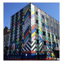 Camille Walala, a 2006 Brighton University graduate, has pushed this further than almost anyone working today - public murals and surface pattern rather than furniture. The Dream Come True building in Shoreditch (2015) is Memphis applied directly to the facade of an otherwise unremarkable building. The Southwark Street pedestrian crossing does the same thing to a stretch of generic London pavement, and I genuinely think it's one of the best small public art moments in the city - it turns an ordinary crossing into something worth noticing.
For me, Walala is the purist of the current generation - closest to the original 80s intensity. The wider contemporary reinterpretation of Memphis tends to run more muted: mellow teals and soft pinks blended with grey, sitting alongside the stark black-and-white patterns that were always part of the palette. Broen Design's Squiggle Lamp is a good example of the softer end - genuinely functional, clearly Memphis-descended, without the confrontational edge of the 1981 originals.
What this looks like at BillingtonPix
My own retro instincts started with Mid Century Modernism before I found my way to Memphis, which I've since developed into my own reading of the print family - the geometric shapes, the clashing colour blocking, the confetti and squiggle scatter, all the structural elements the original group actually cared about.
I've written a proper guide to how that translates into menswear specifically, if you're here for the fashion side rather than the design history: Memphis Style Fashion for Men covers the visual language and how to actually build an outfit around it. The full print range lives in the fashion meggings collection, alongside the rest of what I'd call men's self-expression and identity as a wider project. It also shows up regularly across men's activewear more broadly now, which says something about how completely Memphis has been absorbed into things that were never furniture to begin with.

Memphis was declared dead by more or less the same critics who'd called it inevitable a few years earlier. That was 1988. It has been coming back ever since, and it never quite arrives in the same room twice - furniture, then fashion, then a typewriter, then a pedestrian crossing in Southwark, then a pair of leggings.
I still don't know what happened to that wallpaper. But I know exactly why a teenager with squiggles on his bedroom wall ended up here.