Why Bright Wrestling Colour Still Works
Professional wrestling has always understood something mainstream menswear occasionally forgets: clothing is part of the entrance. In the 1980s and 1990s, televised wrestling turned athletic gear into identity. Colour was not decoration. It was recognition. A silhouette, a stripe direction, or a gradient panel could tell the audience who someone was before they even reached the ring.
That visual logic still holds up. The diagonal geometry and soft gradient blocking in the Pastel Rainbow collection follow the same rules that shaped classic ring gear. Strong contrast. Clean symmetry. Colour used with intent rather than restraint.
The 80s Made Kitsch Look Confident
The golden era of arena wrestling leaned into spectacle without apology. Neon panels, metallic finishes, lightning motifs, and bold colour blocking were not excess. They were clarity. Wrestling borrowed freely from pop graphics, nightclub lighting, and early broadcast-era sports presentation to create outfits that could be recognised instantly.
You can see that legacy clearly in the looks explored in the 80s wrestling cosplay guide, where colour and silhouette worked together to create characters that felt larger than the arena itself.
The same visual language shaped the era of performers who treated ring gear as personal branding rather than uniform. The evolution of that approach is mapped in the history of flashy ring gear, which shows how bold colour moved from spectacle to signature.
From Ring Entrance to Modern Activewear
What once read as theatrical now reads as deliberate. Retro sports colour blocking has returned across training gear, festival clothing, and summer layering for a simple reason: it solves the problem of anonymous activewear. Instead of disappearing into black and grey, it creates presence.
The Pastel Rainbow collection fits naturally alongside the wider Retro 80s collection, where colour-driven silhouettes carry forward the same arena-era confidence. It also sits comfortably within the ideas explored in the Men’s Style Guide, which looks at how expressive athletic clothing works as part of everyday identity rather than costume.
Kitsch Only Works When the Geometry Is Right
The difference between novelty and style is structure. Wrestling understood this early. The strongest looks relied on symmetry, movement-aware panel placement, and one dominant colour story supported by contrast rather than clutter.
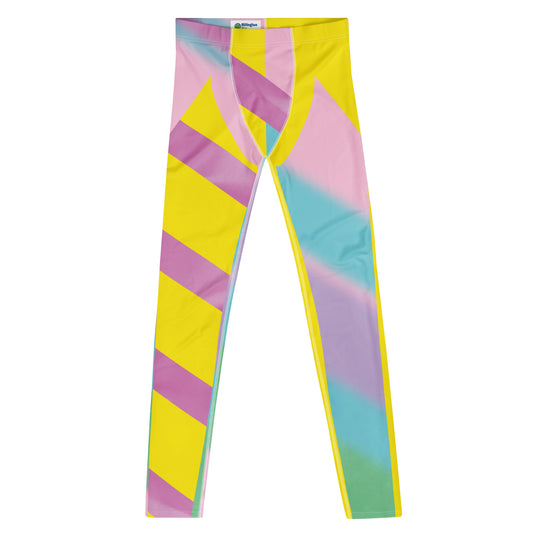
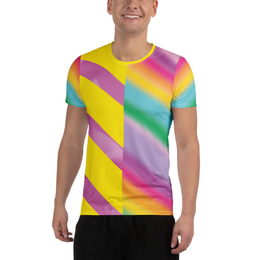
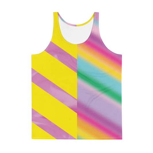
The Pastel Rainbow set follows that same logic. The yellow base anchors the palette. The diagonal stripe introduces motion. The gradient softens the edge without losing definition. It reads clearly at distance, which is exactly what classic ring gear was designed to do.
How to Wear the Pastel Rainbow Set Now
The collection includes the leggings, athletic t-shirt, tank top, and basketball jersey. Each piece works independently, but the full set creates a layered silhouette that echoes vintage warm-up gear and televised entrance styling.
If you want a cleaner look, combine one Pastel Rainbow piece with neutral layers. If you want the full effect, wear the set together and let the colour blocking do what wrestling gear has always done best: create recognition before conversation.
Why This Look Still Matters in 2026
Minimalism still dominates most activewear, but it is not the only direction available. Retro athletic colour offers something different: visibility, personality, and optimism. That is why geometric kitsch from the arena era continues to return across gym clothing, festival styling, and statement sportswear.
Seen that way, Pastel Rainbow is not nostalgic for its own sake. It is part of a longer tradition of performance-driven design that understood early on that clothing could be expressive without becoming costume. Wrestling figured that out decades ago. The rest of menswear is catching up.